A FRESH LOOK
I had the chance to update the logo and overall brand look for Golf Digest Planner and Tournament Shop. A subtle condensing of the two part logo, some bold color and modern type, I was able to refresh this decades old web-based brand into one that can contend in today's web and social space.
DIGITAL

Web + Social Images
Keeping the brand's existing color palette, we wanted to visually exemplify brands like Under Armor, Nike, and Adidas.
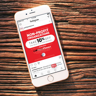
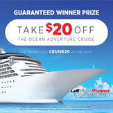
I chose to use the bold red as the major color in web and social media - without overwhelming the user. The red accented the black and white cleanly and gave me the opportunity to highlight golf imagery and some of the shop products on the standout background.
Using the standalone golf ball to create stark, minimalist imagery, I was able to successfully elevate the brand's overall tone while still keeping the modern, sporty retail feel.
While the bold red is eye catching, I wanted to be able to use photos in posts as well. I used the rounded rectangle as my base and stuck to the same type-layout. Solidifying two main elements to be used in the majority of promotional posts made it easy to use both photos and the bright red background, while still sticking to the overall Golf Digest Planner brand feel.
BRAND

Apparel + Swag
Golf Digest Planner and Tournament Shop is an online golf event planning tool and retailer catering to large and small events all over the country. My objective was to elevate the brand from a simple online sign retailer to a modern, athletic retail brand.
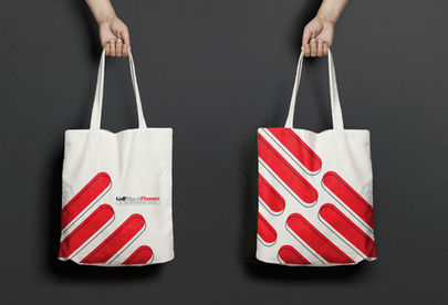
With connections to Golf Digest Magazine, the brand needed to emulate the look of any other golf brand and retailer. I updated the logo and created some new retail items for
employees, golfers and event-goers to utilize and purchase online.
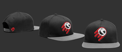
I created a secondary logo for a potential brand of golf apparel that catered to younger golfers and male consumers. Keeping the typeface G from the Golf Digest Planner logo and rotating it 45 degrees created a "winking smiley face". Placing that in a white circle created the look of a golf ball, and adding the same rounded rectangle element in a few key places made it look like it had just come off a big swing.

Business Cards
A fresh logo meant fresh business cards. I kept the front as direct as possible, adding a golf ball on one end to balance out the length of the full logo without overpowering it.
For the back, I kept the pop of color in line with the logo, saving the red solely for the last name. Keeping the rounded rectangle in play, I used it to highlight the position of the card owner, and reversed out the icons in the same rounded rectangle shape with a full bleed off the card.
eBooks
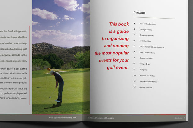
Planning golf events can be tough, and Golf Digest Planner can't do it all. While we can and do provide a lot of support and materials, our clients still take the reign on planning the overall event - most of which starts up to a year in advance.
With so many details to consider, and since its our actual job to plan the tournaments, we put together an eBook to help guide our clients (and anyone else!) through the process.
Presenting so much information in a pleasing, easy to follow manner was a challenge. With such a copy-heavy objective, I didn't want the key details to be missed. I laid out clear dividers in the content and then pulled further quotes and key objectives to emphasize the important notes so anyone skimming through could find and absorb the content quickly.
Being a free download and presuming organizers would download and print specific pages, each page needed to stand alone out-of-context, while still fitting seamlessly into the overall layout.
Starting with just a 30-page word document, I successfully condensed all the information into 18 pages full of color photos, pull quotes, and step-by-step how-to's.
Tournament Signs
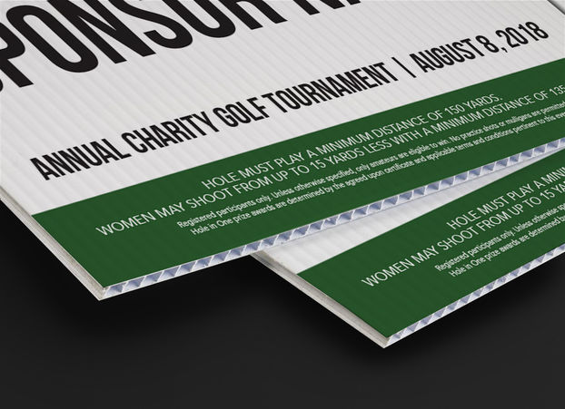
As a one-stop shop for planning golf events, we have an inventory of over 75+ shootouts, contests, and prizes to offer our clients. Each tournament package comes with their own set of course signs to be placed on each hole.
I updated and designed the corrugated plastic outdoor signs that ship to each of our event organizers. With prizes ranging from technology to travel, each sign had to maintain the same layout and shape for ease of production, while still accurately displaying the contest or prize and properly showcasing the sponsor logo or company name.
I used the same circular key-hole style for signs in multiple sizes. Signs were produced on corrugated plastic.


